
Design 101 with Harris
Seeing as many of us have possibly more time on our hands right now, it seems like the perfect time to learn a new skill or get better at something you’ve always wanted to. In that vein, we thought this would be the perfect time to launch a new series of articles aimed at celebrating the skills that members of our community have and maybe teaching each other what they know!
I have to start by prefacing this article with the fact that I’m by no means an expert at designing pictures and have had no formal training on this; everything has come from trial and error and trying to improve on my last design. There are countless YouTube videos and articles that are written by people who know what they’re doing a lot more than me – but think of this as a starting place and you can get more specific if you want later!
What Software?
There are a load of different software and web apps out there that suit different purposes. Rather than recommend a certain software, I’m going to try and keep this as broad as possible and focus on broad design skills and ideas you can apply whatever you’re using, whether that’s PowerPoint or Photoshop or anything in between.
If you’re really curious about what I use though, I do most of my designing on the free software paint.net – which is a nice halfway house between Paint and Photoshop – especially if you download a flurry of plug-ins to make it more powerful. Depending on what I’m making though, I heavily use PowerPoint, Word, Adobe InDesign, Spark Post & Canva.
Let’s start with a nice font

This is where I start almost every time – coming up with a short, snappy title or phrase to be the focus of the image or post and then experimenting with fonts (or to be correct typefaces) until I’ve found something that suits the vibe of what I’m trying to get across. At the very least, try and change the font to something that is less used - nothing turns people off more than a stock font they’ve used countless times (I’m looking at you Calibri).
On top of the stock fonts on your computer, you can find loads of interesting fonts online, some of the places I use most are dafont and 1001fonts – which have thousands of interesting fonts which you should be fine using as long as it’s not for profit. Once you’ve downloaded and installed a font (super easy to do), it should be available on all the programmes you use – just be aware that it won’t always show up on other people’s computers unless its saved in a format that preserves the font (like PDF, JPEG or PNG).


Simple is Sexy
Simplicity is key to ensuring people take the right message from your image. Remember you don’t need to put all the information on your image – you can always write more in spaces around the image, such as in a text post or webpage, or indeed in additional images (especially with Instagram). I find it helps to categorise the information you want on an image into discrete blocks (see image below) and keep a consistent font, size and colour in these blocks. This makes your information easier to process block by block.

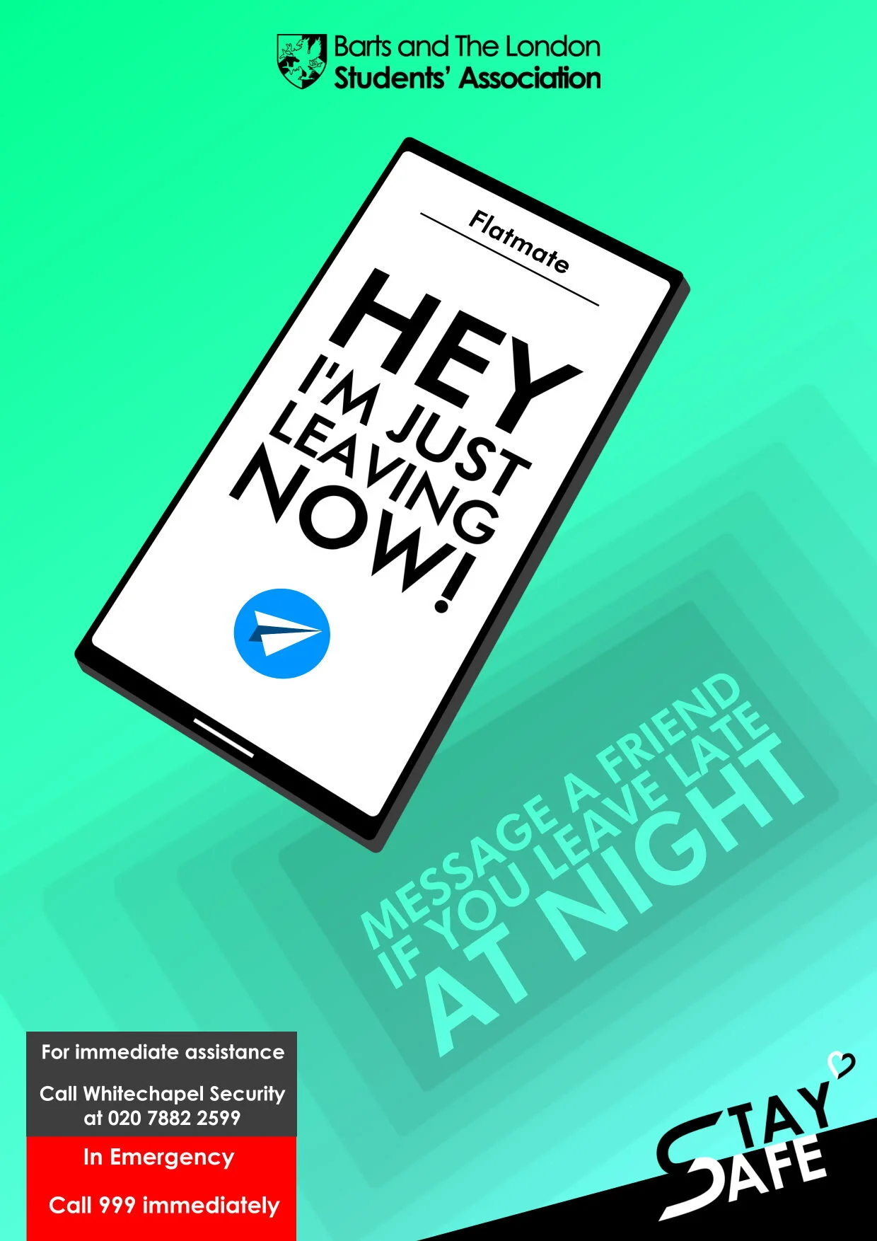
Blocks of information help you get across lots of information without overwhelming the audience
Another common pitfall is making text as large as they can be. While it might make sense to try and make everything as big as it can be to attract attention, it can also make the whole design look a bit naff. Don’t be afraid of exposing that free space and making text a bit smaller – it can really lift the whole design. Having said that, it’s very much a balancing act between size and how good it looks, so don’t be afraid to experiment! Remember your designs are almost certainly going to be viewed mainly on a mobile phone so think about how that might affect your spacing.
Finally, let’s talk about colour. I personally find it best to stick to around two main colours, which don’t include black and white - as they work with pretty much any combo. If it’s a lighter, fun message then bright colours (such as highlighter tones) work well, whereas dark colours work well for more formal or serious posts.


Think about your corners & edges
Corners and edges are naturally great places for less important blocks of information or logos to go, whilst not making an image too busy or crowded. Depending on how many blocks you have, you can use anything from one corner to all four. If you have more information to display, you can always use an entire edge to display multiple pieces of information at once.
To make sure these pieces of information don’t get lost, it helps to highlight them somehow – a nice shadow or highlight band can bring these details out nicely (see some of the examples below). If you’re not using an edge for anything, it’s also a great space to bring some creativity into the image with an element or fade.


What’s Your Background?
The background helps set the tone of the post you’re making, and there’s a huge range in the style you can go for. If you’re looking to keep it simple, something as easy as a gradient can really make the main text pop, especially if you use bright colours.
For something more complex though, it makes sense to use a more complicated texture or image (see examples below). If things are getting a bit busy, you can always blur the background to keep the vibe but ensure it remains readable! In terms of images, websites such as Pixabay, Unsplash and Pexels are great places to find creative commons images you can use without worrying about copyright.


Have Fun!
This is more of a general point, but fundamentally the best engagement comes from posts that are fun and more personal! Students get bombarded with posts from all sides so try and think up the most fun way to get your message across. This can range from anything from posts that are more personal (the trend of introducing committees with baby photos is a good example of this!) or having a funky font or message.
That’s pretty much it from me, the best advice I can give you from here is just to start making things; experiment, learn from the process and experiment again! There’s a clear progression of how the images I’ve made have looked better and took less time every time (see below), and that only comes with practice.
The DentSoc page from the BLSA Guide in 2017
The DentSoc page from the BLSA Guide in 2019
The RAG Week Poster in 2017
The RAG Week Poster in 2018